Color Swapping Cross Stitch Patterns : Conversion Tips
Today I wanted to talk about color swapping, a way to customize your cross stitch patterns to better suit your preferences. A good way to both express yourself creatively and work through your stash. What does it mean? How do you do it? SHOULD you do it?
Well a lot of this is very subjective so we’ll be working more in theory than in examples today. But let’s discuss it together. First of all, what and why would you want to try color swapping a pattern? There’s a lot of reasons why you might, so use the Table of Contents to skip ahead if you’re just looking for tips on how to do it.
Table of Contents
What is Color Swapping?
As the name implies, the idea is to change out some of the colors in the cross stitch patterns with different colors of your choosing. Some refer to this as ‘conversions’, especially when reworking a large amount or the entirety of the pattern.
This process also might be referred to as substituting. Though usually substitutions are due to not having a color on hand rather than because you want the pattern to look different. Regardless. That’s a valid reason to change colors as well! In fact, let’s talk about why you might want to do this to begin with!
Why Color Swap?
Okay, WHY would I want to change the colors in a cross stitch pattern? There’s a lot of reasons you might want to try color swapping! Here’s just some of the reasons I could come up with off the top of my head:
Stash Busting
- Are you missing some of the colors the pattern calls for? Don’t want to head to the store or pay for shipping a single skein? Is the brand of thread the designer uses not easy to get where you live? Swap them out for something you DO have on hand!
- Did the pattern call for a discontinued color? No need to go out of your way to track down the mythical 868, just substitute in a different color!
- Do you have a stock of different brand threads or unlabeled threads you got second hand or at a discount? This is a good way to use those up.
- Do you have a stash of fun variegated, metallic, glow in the dark, or silky threads you don’t quite know what do with? Rather than waiting to find a pattern that calls for them specifically, consider substituting them in on your next pattern!
For example, I really wanted an excuse to use the The Gentle Art threads I had picked up a while ago. But none of the patterns I found for this brand either fit my style, or fit the colors I had impulse purchased without a pattern in mind. Instead, I took this free pattern from FlossyFoxShop and subbed in my Classic Colorworks threads to personalize it. It has such a different feel to it now, doesn’t it!
I still haven’t gotten around to fully finishing it into a bookmark, but that’s not the point of this article. 😉
Fabric Choices
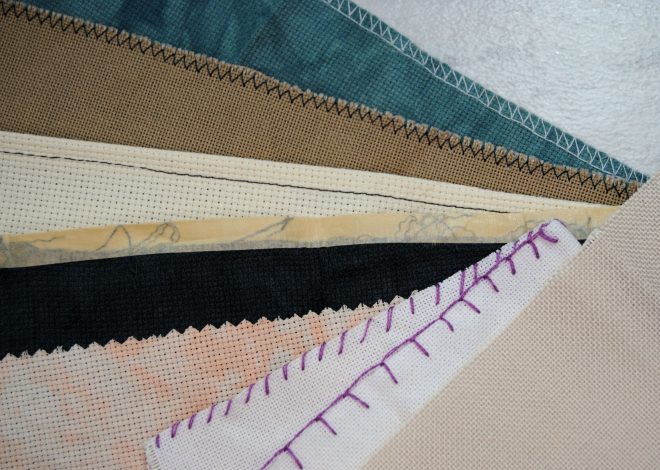
- Have you ever found a pattern you want to do on a specific color or hand dyed fabric but part of that pattern just kinda blends into the background? You could just swap those colors for something that has more contrast on that fabric!
- Or maybe you want the pattern to just better complement the colors of your chosen fabric. It’s entirely up to you!
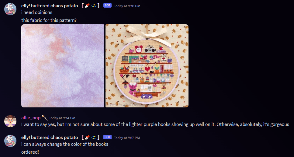
Here’s an example that popped up in the Pixel Stitch Discord while I was writing this article. The lovely pattern pictured is by FuzzyFoxDesigns.
Personalizing Gifts
Another common reason for color swapping is in order to personalize gifts.
- Want to stitch a cute family portrait for your parents but your skin tone or hair color doesn’t match that pattern you found? Swap the colors out for ones that better represents YOU!
- Making a gift for a pet owner? Swapping colors to match their well-loved pets can be a lovely gift.
- Stitching up a wedding present? Consider using your couple’s wedding colors to really personalize it for their special day!
Design Practice
Want to design patterns, but haven’t quite worked up the courage to do so yet? Color swapping can be a fun way to dip your toes into it by figuring out color palettes you like to work with and getting to know the full line of colors available.
Changing the colors of a pattern forces you to really look at the original colors and determine why they were chosen and how they work together — all good skills for a budding designer!
Or maybe you just like the challenge of customizing a design!
General Aesthetics
Okay maybe you’re just stitching it for yourself — that doesn’t mean you shouldn’t customize it!
- Where will you be displaying your finished stitch? Maybe you found the perfect pattern but the colors clash with the rest of your decor. Time to try color swapping and substitute in colors that better match your aesthetics.
- Even if you don’t want to swap out the colors entirely, maybe you prefer pastels over bright saturated colors. Maybe you want to tone down the colors for a more vintage/faded feel. It’s entirely up to you!
- Everyone has favorite colors and sometimes you just feel like you’d an enjoy a pattern better if it featured those favorites. You don’t need a reason! Do it just because you want to!
Is it OK to Color Swap?
This is a trickier question than it seems — not all cross stitch designers like having their patterns modified!
Changing the colors doesn’t mean you hated the pattern and the designer is terrible at picking colors. On the contrary — you loved the pattern SO much you’re taking extra time out of your day to personalize it and stitch it rather than go find another design that fits your style more!
I personally LOVE seeing how creative people can get with my designs so I’m definitely giving you all the permission and encouragement you need to swap out the colors on any of my patterns, but that’s not true for everyone. So here’s some ways to find out if a designer is OK with pattern alterations.
Check the Pattern or Listing
One of the easiest ways to know if a designer is okay with it is by checking the pattern itself. Some designers (myself included) mention in our pattern PDFs that we encourage color replacements.
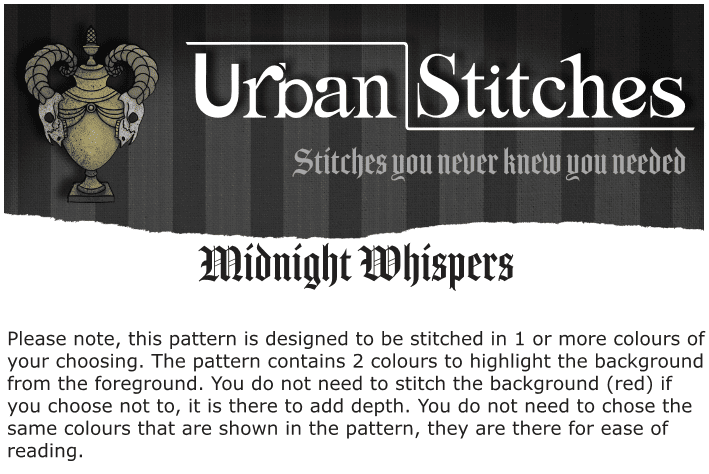
Here’s a peek at the UrbanStitches PDF for the Midnight Whispers SAL as an example;
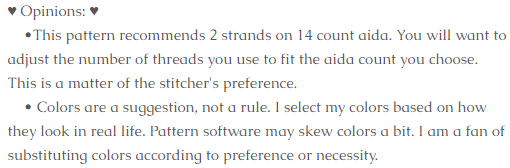
Others state it in their pattern listings. For example, NightSpiritStudio states right in her pattern listings “I am a fan of substituting colors according to preference or necessity.”
Check for a Precedent
Another way to know if a designer is okay with it is by checking for other stitchers who might have tried color swapping their patterns already. Heck, you might even find color palettes already pre-picked out for the big name designers.
Or you might find where a designer has been upset or specifically requested people not make changes to their patterns — that’s valid too.
Full pattern conversions used to be a pretty common sight back when I frequented cross stitch forums. (Yep, I feel old too.) Here’s some great examples from well known designers.
Mirabilia
There are a ton of conversions floating about the internet for Mirabilia designs — there’s even a facebook group devoted to Mirabilia Full Conversions.
Nora Corbett herself even mentioned in a reddit AMA that she encourages color swapping!
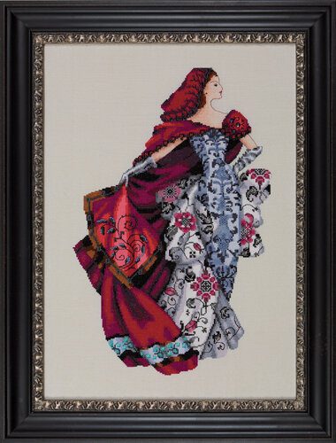
A good example I found for Mirabilia is the pattern ‘Red’. Which has been converted to purple, teal, blue, and antique blue. There’s definitely others out there, but these 4 conversions were all just by one person! Each time the colors being swapped as a gift for one of her children. How lovely!
Not to mention a great way to make the process of stitching the same pattern 4+ times less tedious.
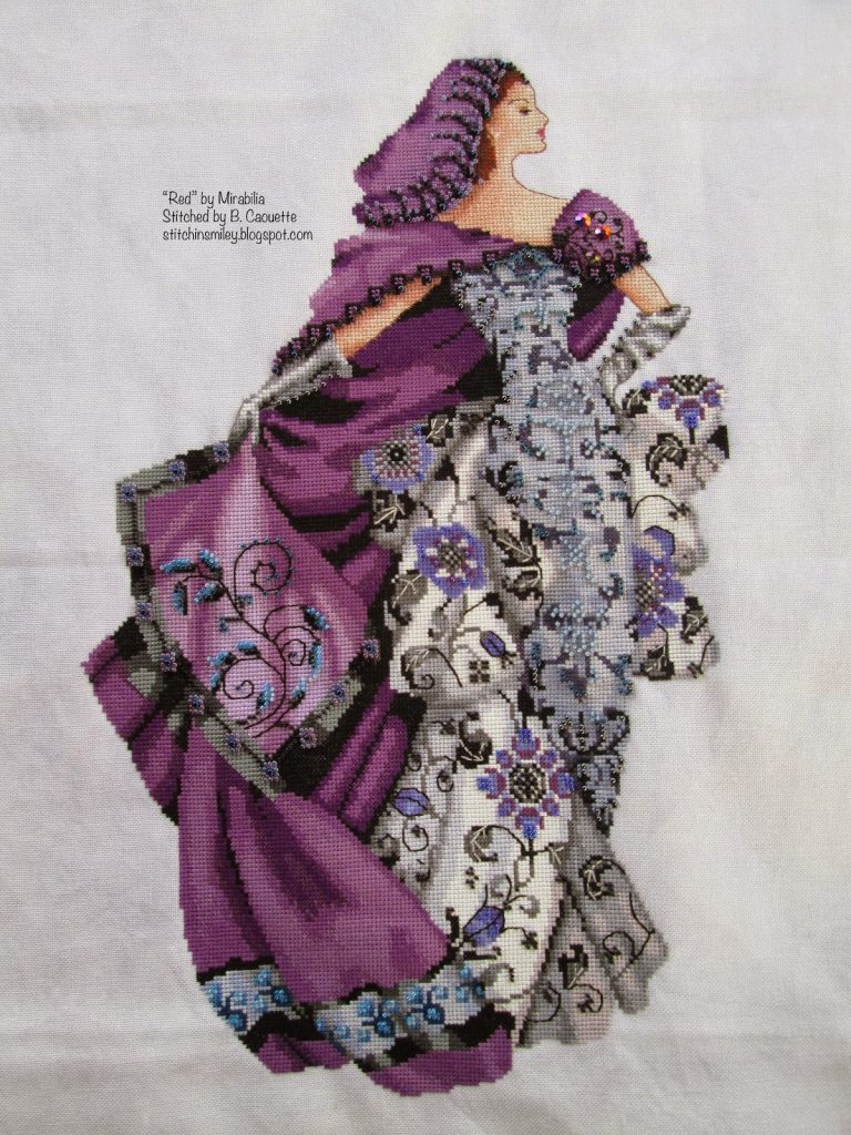
Purple conversion above by Stitchinsmiley. Check out their blog for several other conversions of this pattern!
Lavender & Lace
Another good example in a similar vein to Mirabilia is the Lavender & Lace patterns.
Specifically, I usually think of the ‘Celtic Ladies’ series. Though many of the L&L patterns have been converted over time.
My favorite example of this is the Celtic Autumn design. I absolutely love this conversion into Celtic Samhain which gives her an orange/black color palette. But I’ve also seen her converted into an orange and green palette. Plus I’ve seen various conversions for the other seasonal ladies as well. It’s just a matter of looking around for what others have done, or possibly tackling the conversion yourself! We’ll talk about how to do that shortly.
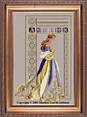
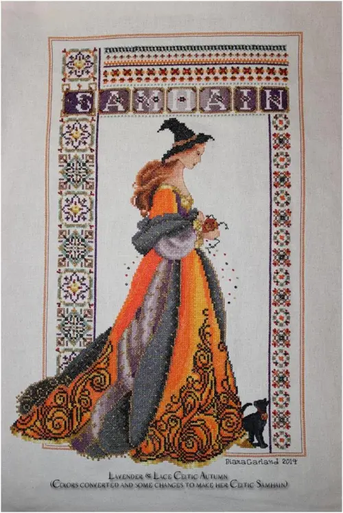
Samhain Conversion above by Tangled Skeins in Time.
Ask Designers Directly
Still not sure if your designer is okay with you changing up the colors on their designs? Ask them! I know it can be intimidating to do so, but honestly most designers will be happy that you thought to ask to begin with. They may even offer to help if you get stuck and want some recommendations, or will be willing to do it for you at a commission!
And if they say no, that’s ok too. At least now you know for sure!
As an example, I personally reached out to FlossyFoxShop to confirm if she’s okay with people converting her patterns for that bookmark I shared earlier. Not only is she okay with it, she loves it and wishes more people felt comfortable doing it! Which is what we’re aiming to change today. 😉
Similarly, in the Fabric Choices section I reached out to… the people in the screenshot to make sure they were okay with me posting it. But also to FuzzyFoxDesigns to confirm she was okay being used as an example here. She also confirmed she enjoys seeing people use her patterns as a springboard for their own creativity.
Can’t Ask?
There are of course situations where you can’t ask the designer. Vintage books you found at the thrift store. Old magazines featuring artists that are just no longer around. That unlabeled pattern stash you inherited from Grandma. If you can’t find a way to contact the artist, and you’re not finding examples online, there’s not much you can do to confirm they’d be okay with it or not.
In which case my only advice is to just go for it. There are so many patterns out there for you to be stitching something you’re not 100% happy with. You should stitch what makes you happy. You’re stitching this for personal use or for a gift, after all. (Because asking for permission to sell a finished piece is ALSO important.)
And statistically, a majority of designers are OK with it. They likely got into designing so they could stitch what made them happy, after all. Why would they not want you to do the same?
How to Go About Color Swapping
Alright, so you’re convinced. Or you were already planning to make some color changes and that’s how you found this article to begin with. Well now what? How do you actually go about color swapping?
Well I can’t possibly address every single scenario possible, but let’s discuss the process and some of the things I look out for when changing colors.
Identify What Needs Replacing
Are you changing ALL the colors in a design? Do you just want to change one element in a specific pattern? The first step is honestly just deciding what it is about the pattern you’re looking to change.
If you’re just converting pattern colors from one brand to another you may want to skip ahead a bit to the section on brand conversions.
Make Note of the Number of Colors and Their Values
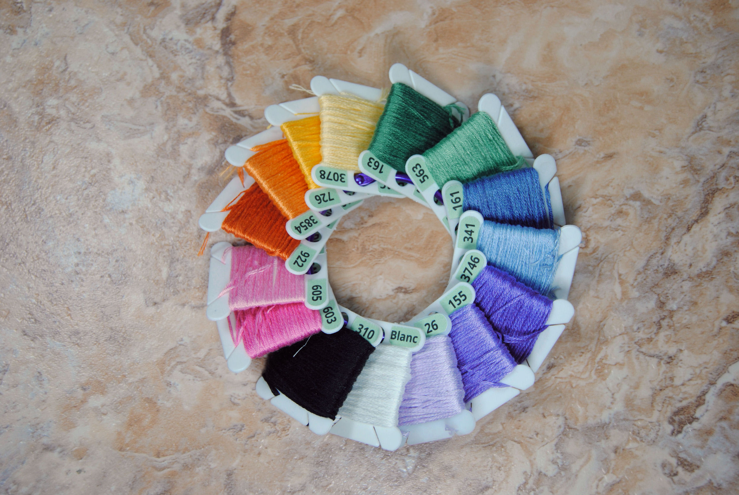
How many colors are you needing to change? What colors do you want them to be instead? Group them together by color and make note of how many values are involved.
Is the pattern just made of single flat colors? Does each have a darker and lighter version of a color for shading?
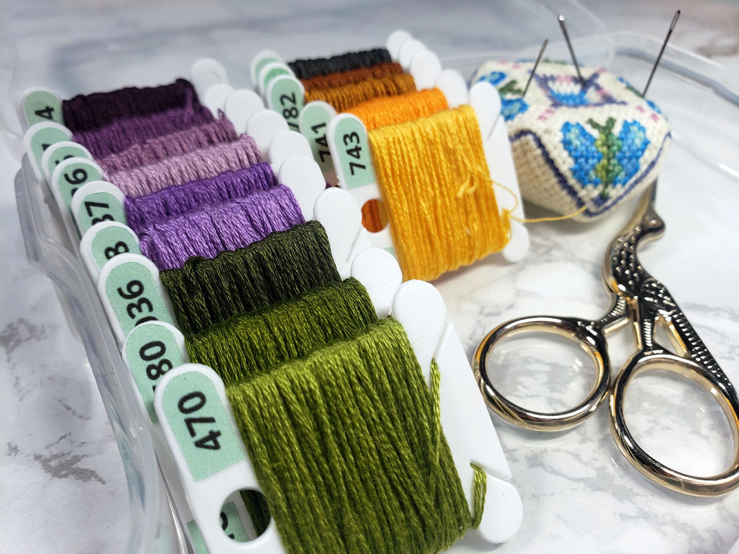
My patterns tend to come in sets of three. A dark, middle, and light color (like the greens pictured here). But sometimes that will go down to two (like the yellows) or up to four (like the more muted purples in the back) depending on what I need in a design.
Identifying how many values of a color you will need is a great starting point.
Make Note of The Colors You’re Not Changing
You also want to keep in mind any colors you’re NOT changing. For example, if you were swapping out a section of a pattern from greens to purples, you have different types of purples to choose from.
You could use ‘cool’ purples that lean more blue like 333, 3746, and 155. Or ‘warm’ purples that lean towards the red tones like 154, 3834, 3835. This choice could be based on your preference of course. But it could also be based on what other colors are in the pattern.
If your pattern already has a lot of red you might want to lean into that to make it more cohesive. Or you might want to use the blueish purple if you want that section to contrast more!
You also want to make sure the new colors are the same value as the colors around them unless you specifically want them to stand out. So if the original pattern is more muted colors and you’re just swapping out a section of them, you ideally want the new colors to be muted as well. If you swap in for bright saturated colors instead they’re really going to stick out.
Decide What New Colors You Need
Decide what colors you’re aiming for. Not the exact color numbers necessarily. Just something like “I want this section to be blue instead of pink.”
This is also a good time to make note of what KIND of color, how many of that color, etc.
For example, “The new blues should be pastel blues to match the other colors in the pattern, and I need three of them. A dark, middle, and light blue. The dark and middle values are somewhat similar, but the light value is much lighter than the other two”
While you certainly can just pick colors, do a test, and play around until it looks good… you might also want to make use of some color theory to help you make decisions along the way if you’re not sure what colors you’re going for yet. Even if you just learn some basics like knowing what colors are complementary. Or some of the other common color schemes like Analogous or Triadic colors.
Make a List of Potential Colors
If at all possible get out all the called-for threads for the project, or identify them on a real thread color card. If you don’t have them in person, try to at least google photos of the thread colors rather than relying on single color values from a program or printed color card. Colors like to change in lighting and when put up next to each other.
Then start getting out *potential* colors that might fit your ideal conversion. If possible, put them up next to the original colors and the colors you’re planning to keep from the original design to see if they work well together and are the same brightness or vibrancy you’re going for.
Narrow it down to the colors that appeal most to you visually when placed next to the others. Write them down somewhere. But also have a second or third choice just in case.
Do a Test Swatch
I highly recommend doing a test until you’re confident in what colors work well together. It doesn’t have to be a big section, but at least a few stitches of the new colors next to each other. As well as any colors from the original pattern that are going to be right up next to the new colors.
Ideally, try your second or third choices as well. sometimes those look even better once down on fabric.
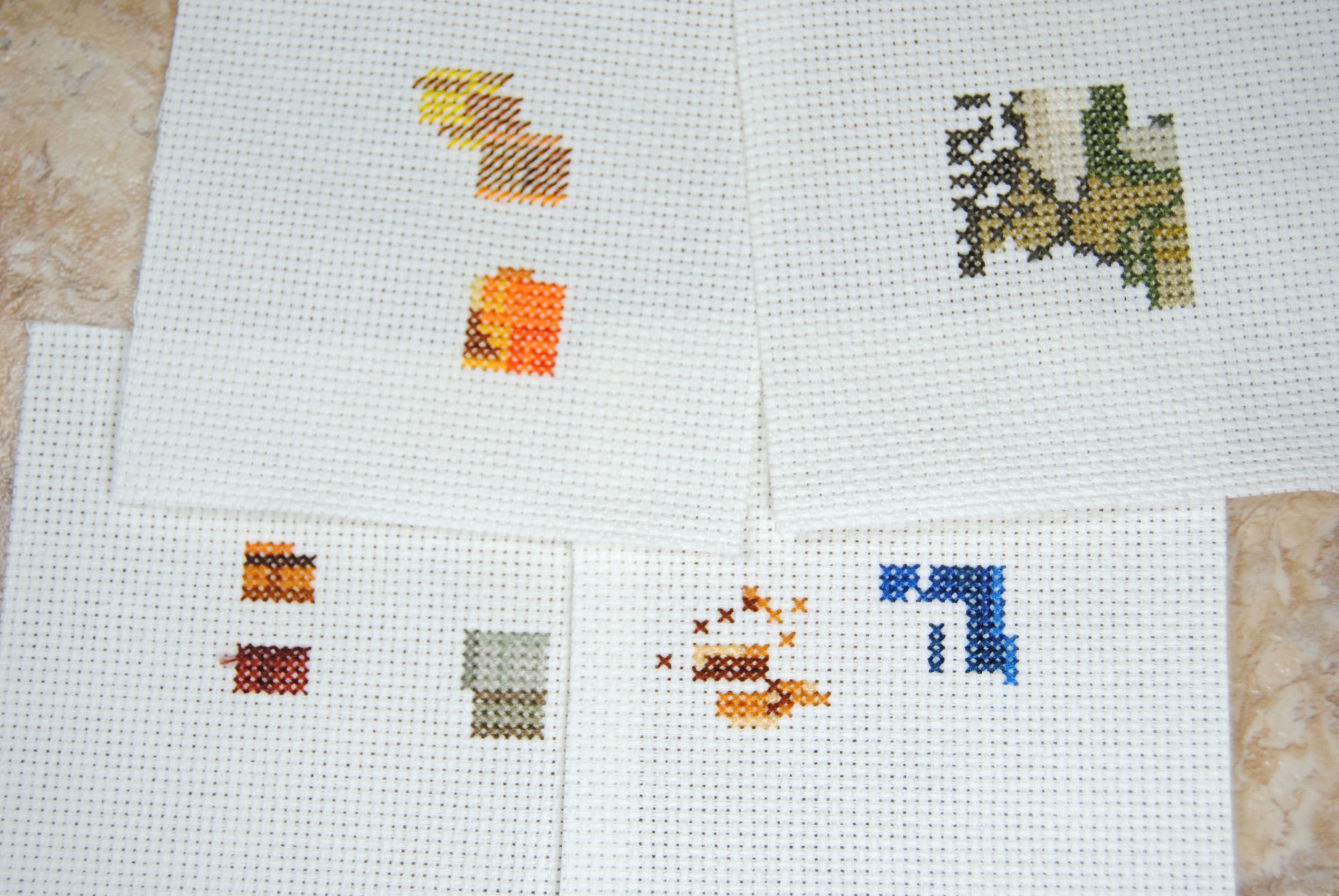
As an example, here are some swatches I did while testing colors for the Undertale Cross Stitch Book. You might recognize some of these patterns just from the colors. But you’ll see I did not stitch large amounts as I simply did not have the TIME while writing the book. I just picked a section of the pattern that had a lot of the colors involved and stitched up that area. Sometimes I did just half stitches to speed it up just to get a good look at the colors next to each other.
Putting the bobbins next to each other is not always enough. In my experience colors can look quite different when stitched next to each other rather than on the bobbin. Thread is a 3-dimensional object that reflects light and the colors around it. So do a test swatch if possible.
What to look for while testing
Identify any colors that are too similar. Sometimes colors look like they have enough contrast when on the bobbin, but once stitched next to each other they look almost the same and blend together. You might want to go a slightly darker or lighter shade for one of them to make sure they’re still distinct. Unless you’re going for that subtle gradient, of course.
Check for hues clashing with surrounding colors while you’re at it. Remember we talked earlier about how colors can lean either warm or cool? Purples leaning reddish or blueish? That goes for other colors as well. Greens can lean more blue or more yellow. Yellows can lean more brown or red. Do the ones that you picked look like they fit in?
Don’t be afraid to frog and restitch until you find the right color combinations!
Example Project
I’ll be making some changes to one of my freebie patterns as an example for here. You can get this free Summer Christmas cross stitch pattern from my Ko-Fi if you’re interested.
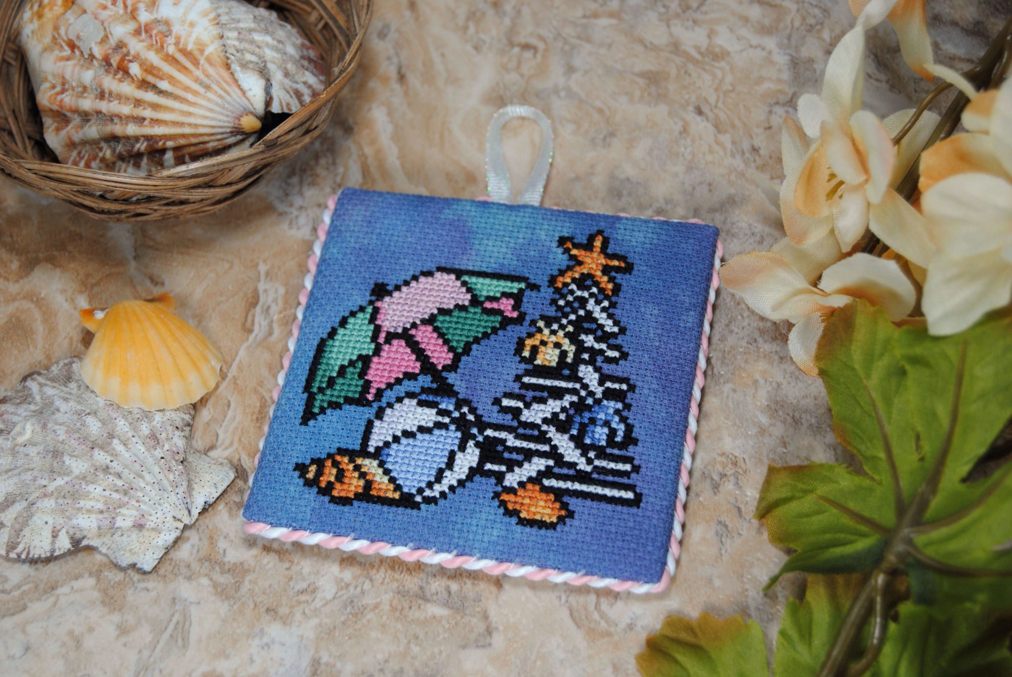
Basically I will turn the Christmassy colored umbrella into a rainbow umbrella! Because that’s fun. And maybe make the beach ball into the iconic triadic color scheme of red, yellow, and blue. Even though you can’t really see one of the stripes.
Regardless, the first thing I did was pull out the colors in the existing pattern.
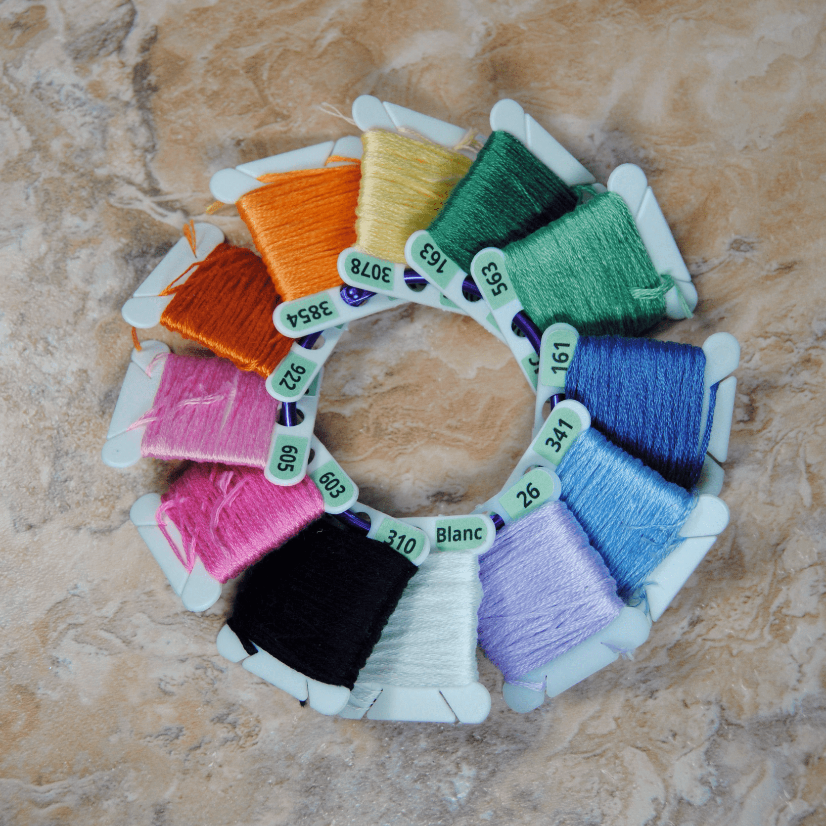
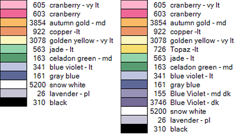
For most of these colors there are two shades. A darker and a lighter version. Except for yellow, which I had used the lighter orange as a darker yellow as I didn’t use the yellow a whole bunch in the original design.
What Colors Do I Need?
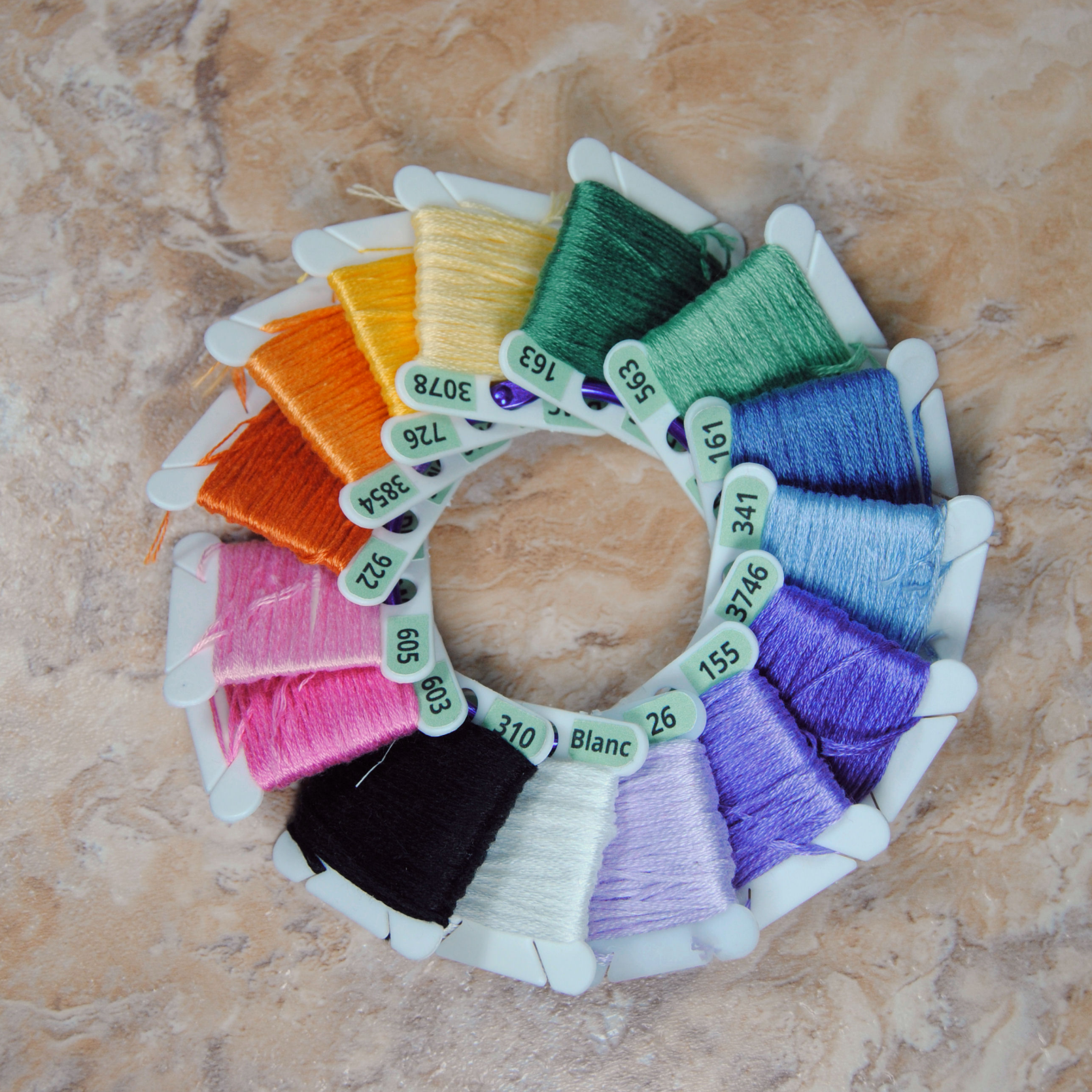
I already have most of the colors needed to make a full rainbow, but there isn’t a purple. The light purple pictured is actually used as a shading for white, so I won’t be using that as a purple on its own.
I noted that in the umbrella the ‘under side’ of the umbrella makes use of the dark versions of the color, and the top uses the lighter versions plus a bit of shading. So I need to find two purples that go with the rest of the palette. Since the yellow and orange ‘slices’ will be right next to each other, I don’t want to just use the orange as shading for yellow here. So I’ll find a darker yellow to complete my rainbow.
Below I show the original palette next to my new one. You’ll notice my purples are actually ‘blue violet’ because I wanted to maintain the overall ‘pastel’ look of the piece. So I didn’t want to use an overly vibrant purple like 333.
Side By Side Comparison
I then got out those colors in person and… did not do a test stitch because this is a theoretical example. I was gonna completely restitch this design but it’s been a busy week and I’m short on time. Gimme a break.
I did however do some editing in PCStitch so that you can visualize what these changes might look like:
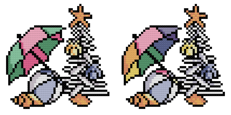
Hopefully this gives you an idea of some of the things to keep in mind while changing colors, even though I can’t give you exact example for every possible change you might want to make.
Tools for Color Swapping
That does bring me to mentioning tools though. Especially pattern programs. Even if you’re not a designer, making use of a program like PCStitch or Winstitch can make it easier to visualize changes. If you don’t mind taking the time to painstakingly copying the pattern in one stitch at a time, of course. You’ll still want to see the colors in person, but the program renders can be a good place to start.
Another way I did it in the past before these programs was to print out the black and white version of a pattern and then coloring in the squares with colored pencils roughly representing the thread colors I wanted. Or rather, walking over to the library and making a photocopy out of a cross stitch book. Aaand we’re back to making me feel old.
Here’s some more tools that you might want in your arsenal though:
- Work from your stash – Having the thread physically in front of you and being able to do test swatches is ideal.
- Local craft stores – If not possible, take that list of colors and your color goals and sit down in the thread aisle at Michaels or your local craft store and look at them in person. If you’re not buying the called for colors, make sure you take the time to put them back in the right section though.
- Color Card – Get a color card, preferably a real thread color card, if you’re going to be changing colors a lot and don’t own the full line of thread. Yes they make them for other brands besides DMC as well.
- Color Wheel – Useful for color theory and determining which colors work well together.
- Color Inspiration – Sites like StitchPalettes can help you find inspiration for color combinations.
- Conversion lists – Which I’ll discuss in the next section:
Thread Brand Conversions
Sometimes you’re not really looking to change the colors in a pattern. You just need them to be a different brand. DMC has gotten so prevalent in many countries we often take for granted how easy it is to come by. In other places Anchor might be the brand of choice, for example. DMC could be hard to find or too expensive. What then does one do?
For example, enui from the Pixel Stitch Discord swapped out the colors in NightSpiritStudios’ Saintly Goat for Profilo brand threads instead of the called for DMC. And did some color modifications in the eyes and fur for an overall different feel.
Conversion charts
Luckily, for many brands people have made conversion charts already. Especially for the most popular ones. Are they ever 100% accurate? Absolutely not. Often there are colors that just don’t exist in one brand. Or there are two colors that are ‘close’ to the one you’re trying to replace.
Having a conversion chart at least gives you a place to start from, and then you can tweak colors from there. Usually just simple tweaks like “this red is too close to the other red in the pattern, so I should swap this out for a darker one even though this color is technically closest to the original.”
To start, it’s all a matter of googling a conversion chart for your preferred brands.
Cyberstitchers has amassed quite a few conversion charts over the years and is a good place to start.
MyStitchWorld also has quite a few conversion charts including one from DMC to Profilo.
I recently put together a DMC to Cosmo conversion chart of my own and can tell you just how much work these entail, wow.
Also remember that your color vision might be slightly different than someone else’s. What you feel is the closest match might be different from what they would’ve picked. So compare multiple conversion sheets or get yourself a color card if you’re planning to do this often.
Just remember that the colors don’t have to be EXACT conversions. Make it your own while you’re at it! Make changes based on the colors available in your preferred brand. Sub in variegated or metallic threads too. This is your own unique piece and there will never be another exactly like it.