Design Challenge: Colors I’ve Never Used Before
Every once in a while I like to do a fun design challenge to keep things creative and fresh. Whether that’s limiting the number of colors I can use, randomly generating a palette, working with a new brand of thread, or designing with a particular finish in mind. This month I wanted to try designing with colors I’ve never designed with before.
If you’d prefer this info in video format, that’s up now;
Of course, in order to determine what colors I haven’t used, I need to first determine which I have used. So this first bit will be talking of spreadsheets. Feel free to scroll ahead if you’re not into the data portion of this, I don’t mind.
What Data Did I Use
So first, what information am I gathering? Technically I started gathering this data years ago. But let’s go over the process that I do every year. I start off by making a list of every pattern I designed that year. That’s Patreon patterns, Etsy designs, Ko-Fi Freebies, etc. What I’m NOT including is personal projects, artfights, or stuff I stitched designed by other artists. So this isn’t even everything I stitched in a year. Early years are a bit more sparse, but I’ve been doing this a long time so I’ve got plenty of data to work with.
I opted to skip the Stardew Valley and UNDERTALE Cross Stitch books entirely. I simply don’t have stitch count data for them.
Additionally, I also left out the cross stitch quilt book tracker I made last year, as colors were picked by the book cover and not something I ‘designed’, but also because I didn’t really keep track. So who knows what all’s in there.
And I left out discontinued colors. I’ve already swatched them all anyway.
Gathering Data
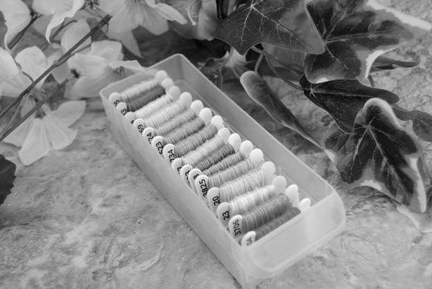
Thankfully my PDF patterns also include a breakdown of stitch count, so it was real easy (albeit time consuming) to copy paste the colors and stitch count for each pattern into a spreadsheet, one year at a time. I also made note of whether a color had been used for specialty stitches like french knots or backstitch, even though I don’t have a specific stitch count for those techniques.
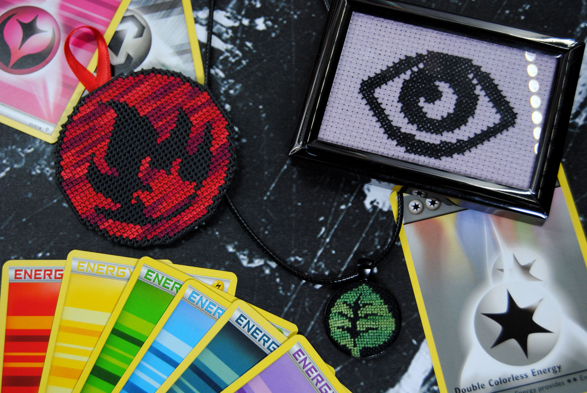
While doing this I also took out any parts of a pattern I hadn’t tested. For example, I patterned 11 freebie pokemon energy symbols, but only personally stitched 3 of them. I also adjusted the colors to represent what I actually stitched them in — those same symbols have just flat color suggestions in the PDF, but I instead stitched two of them with variegated threads.
Combining Duplicates
Of course copy-pasting everything in meant each color used in multiple patterns had multiple entries. That’s why I created the ‘patterns’ column. I sorted by thread number and then removed duplicates, while also making note of how many duplicates there had been in that column. AKA how many patterns that color had been mentioned in that year.
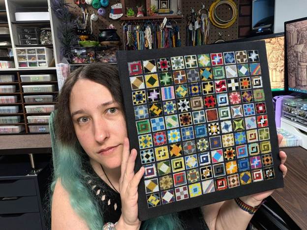
Once all the years were done, I copied each of them into one new tab and repeated the process of removing duplicates. Each year I add an additional year’s worth of data to this sheet. And now that there’s 10 years’ worth of data, I figured it’d be a good time to do this challenge.
The Spreadsheet
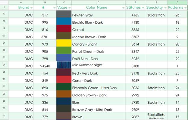
So here it is A spreadsheet of every color I’ve used in cross stitch patterns I designed.
(Note: You’ll need to copy it to your own Google drive to be able to do things like sort by stitches, number, etc.)
Remember when I said this isn’t even all I stitched in any given year? Yeah, that’s still 561,113 stitches of data though. Or about 2494 hours of test stitching at my current average stitches per hour. Never mind the hours spent designing these patterns, frogging and restitching, fully finishing them, taking and editing photos, making the pdfs, and so forth. Yikes.
Plus I somehow went from 39k stitches in 2016 to 52k stitches in 2025. Oh and in 2018 when I ‘only’ stitched 23k stitches? That’s the year I did the Stardew Valley Cross Stitch book which was test stitched entirely by me. So… uhh… it’s actually a lot more than that. I’ve been steadily increasing my stitch count every year somehow and it’s no wonder I’m a bit exhausted at this point.
2026 & Future Data
Depending on when you’re reading this article, you might look at the spreadsheet and see 2026’s data or even future years included. At the time of writing this, I have not started collecting the data for 2026 though, so please assume anything mentioned in this article is strictly 2016-2025, aka the first 10 years of my patterning. But I’ll keep adding to this sheet as time goes by. Until I get bored of it, at least.
Most Used Colors
Now for the fun part, looking over this data and seeing my trends.
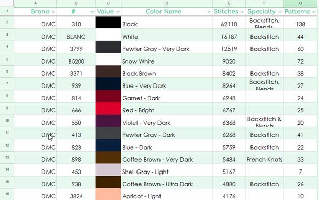
Surprising probably no one, the top 15 most used colors are… kind of boring. Black, white, other white…. the darkest colors in the DMC line, 3799, 3371, 939, 550, 938, etc.
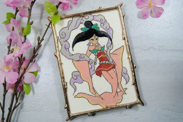
Plus a couple of outliers. How 453 get so high on the list with only 7 patterns? I blame Princess Sakuya, she’s got 2560 of those shell grey stitches alone. And 3444 of the apricot, for that matter. Just goes to show you how just one pattern can have so much weight to it when it comes to this kind of data.
Second Most Used
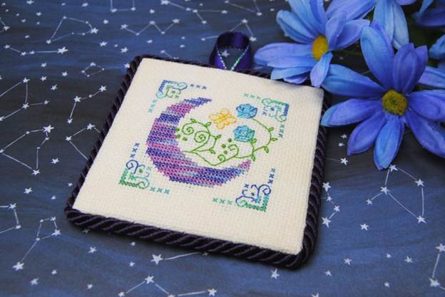
The next 15 are a bit more interesting, and shows my bias towards… jewel tones? What do you even call this? Once again I’ve got V4240 here somehow despite only being used in one pattern. Though to be fair it’s another large pattern, the Skyrim Constellation SAL
Only Used Once
There’s actually quite a few colors I’ve only ever used once. Especially when it comes to specialty threads like variegated and metallic, as well as other brands like Cosmo and Anchor. But what’s interesting to me is the plain DMC cottons that haven’t gotten much use. Not because I’m specifically avoiding them or anything. But just that they haven’t come up much when I’m picking colors for a specific design.
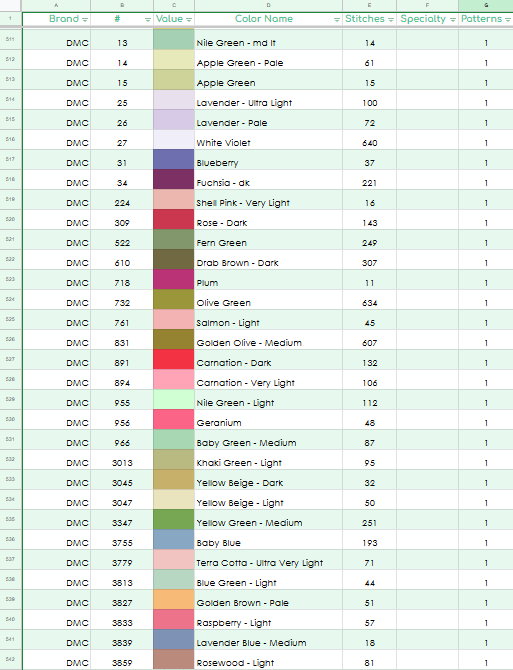
It’s a lot of idk, mid tones? Some muddy colors, some pastels. Some of the ‘new’ colors are in there as well and just don’t get looked at a lot tbh.
Least Stitched With
Still a bit different from those least stitched with, which is mostly metallics, looks like. They’re great for small accents in a design, but I tend to not use them much or use them in a test stitch but otherwise include plain cotton equivalents in the pattern. Mainly because they seen to scare people off a bit. And nowadays Kreinik is a bit harder to find as well.
Still, how did I manage to only use Mouline Etoile C995 for One. Single. Stitch? And how did such a light color like Sulky Buttercream get used only for backstitch and no actual cross stitches?
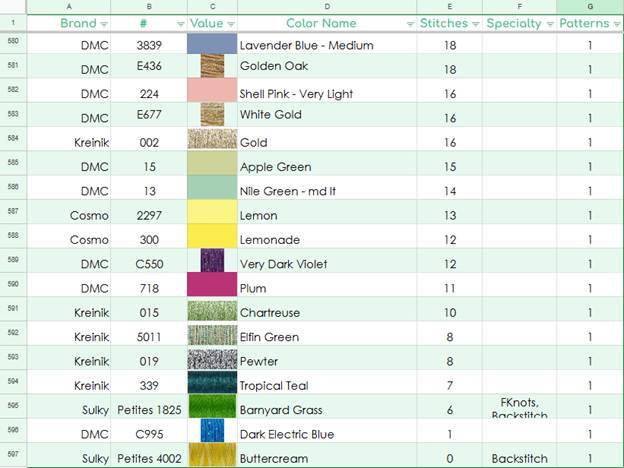
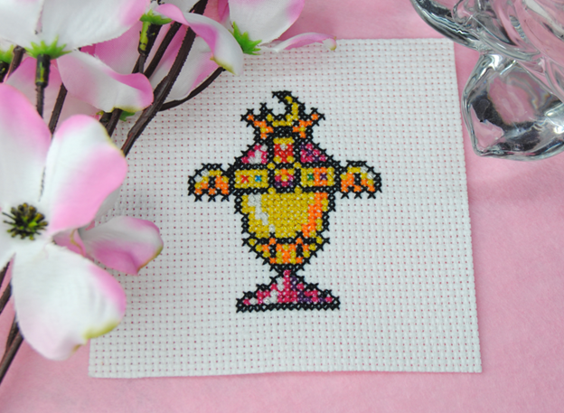
For the curious, that single stitch of blue is from my freebie Sailor Moon Chalice from the Mouliné Étoile review.
And the two Sulky Petites were in the Sulky Petites review where I made this specifically to test the threads’ coverage on 16 count aida and wanted a mix of cross stitch, backstitch, and some french knots to test it out thoroughly.
Unused Colors
So now back to the point of this challenge – Unused colors. Of course there’s a lot, especially when it comes to other brands like Cosmo, weeks, Threadworx, etc. As well as DMC specialty threads like Light Effects. But there’s no way I’m doing an entire design for Light Effects. You can’t make me. Probably. Give it another 10 years when I’m starved for content ideas, I guess.
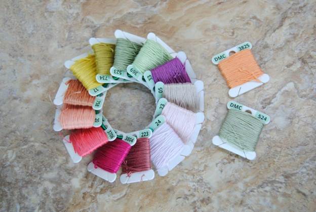
But of the main DMC cotton line, which colors have just… never come up? Turns out it’s a lot of pastel.
Yep, you’ve already seen these as they’re in the header of this article. Whoops, spoilers.
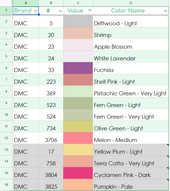
Why are those last 4 greyed out? Because while I haven’t used them yet, I checked some of the patterns I have sitting around waiting to be released and found 4 of them are already planned to be used in 2026! That could change of course if I start stitching and it doesn’t work well with the other colors and I have to swap them out. But for now, they’re at least already in the works. Still, I didn’t use them at all in 10 years so they still count for this challenge!
But hey, this also goes to show you that no one ‘needs’ a full set of DMC threads. Even someone who stitches almost constantly for a decade hasn’t used every single color. If you haven’t completed your set yet, that is OKAY. It’s probably better to buy them as you need them rather than buying them just to have them.
Though having them all on hand does make it easy to design with.
Are you sure you’ve never used them?
Out of curiosity, I checked.
223, 758, 3706, 3825 do make an apperance in the Stardew Valley book
223, 734, 3706, 3804 are in the UNDERTALE book.
So really, there’s only like 8 colors I haven’t used. And for many years I didn’t even have colors 1-35 to work with, sooo. Fair. But this challenge will be hard enough as is with no dark colors, so let’s just go with the 15 from my spreadsheet, eh?
Time to Design
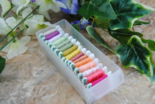
First things first, let’s pull the actual colors. As much as I appreciate cross stitch programs and checklists and having RGB values… nothing is a replacement for seeing the colors in person.
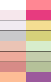
Unfortunately… there’s not a lot of contrast here. They’re all kinda similar hues. Only that dark purple in the back and the dark pink in the front really stand out.
In fact, a good trick for designing is to turn your colors black and white so you can more easily see how well they stand out. And, well… see what I mean?
So to save my sanity, I’ll be allowing 310 in this challenge and probably doing it in the style of my other pastel ornaments… bold black outline, with pastel colors inside.
Regardless of my feelings for the colors, this is what we have to work with. So I brought the approximation of each color into a pixel art palette. They’re not perfect representations of the colors, but good enough to get a general idea while designing.
I did do some brainstorming and doodled some things on to try and figure out what I could use these for. But my brain kept yelling ‘flowers’ at me. When asking others what these colors made me think of, they all basically said the same thing. Spring. Easter. Flowers. Meadows.
I’d show you my sketches, but they’re pretty messy. Just know that eventually I settled on a bouquet. I only wish I had these threads as skeins so I could do a proper skein bouquet as a side by side. Missed opportunities, I guess.
Pixel Art
As I’ve noted in previous articles, I actually do most of my designing in a program called Pyxel Edit. This is a pixel art program, not a cross stitch program. But that’s honestly good enough for most designs, since I don’t use a ton of backstitch.
I did record most of the design process, so hopefully I’ll get that all together into a YouTube video for you at some point. But after a lot of pixel pushing, this is what I came up with.
I ended up not using two of the colors. 524, as it was too similar to 523. It just looked muddy and would only have gotten 3 or 4 stitches anyway. Even the other greens didn’t get a ton of use.
I also didn’t use 3825, which… I’m not sure why, I just couldn’t get it to work I guess. I’ve already got plans to use it later this year at least.
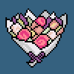
It’s… kinda alright. Admittedly the ‘flowers’ are somewhat flat and mostly arbitrarily arranged. But I did what I could with the colors I had to work with. And overall I’m happy with how it came out.
The point of these challenges is not to come up with something amazing, just to push yourself to try different things and think about colors differently. And that it definitely achieved.
Maybe one day I’ll even finally use 524.
If you want to watch the design process, there’s a timelapse in the video version of this article;
Test Stitching
While I didn’t have to test stitch this since it was just an experiment… I figured since I hadn’t gotten around to stitching the randomly generated palette pattern, I should at least do this one. If nothing else so that I can confidently say I’ve stitched with every color. Well, except for 524.
I wasn’t even 2 colors in before I started questioning these color choices though. Does 05 and 24 really work together? Ehh. Kinda?
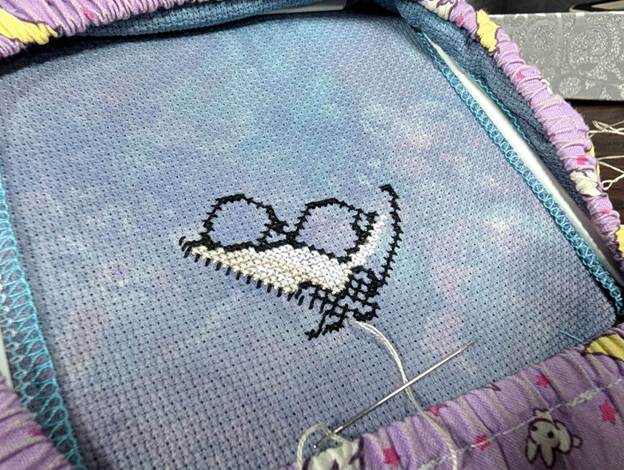
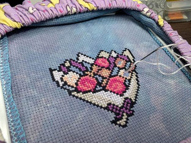
Even once most of the flowers were filled in it didn’t look quite right, and a bit monotone. It really needed that pop of green to really sell this as a bouquet.
Final Thoughts
This was actually a fun lil challenge, and I loved finally being able to put to use my weird need to spreadsheet everything.
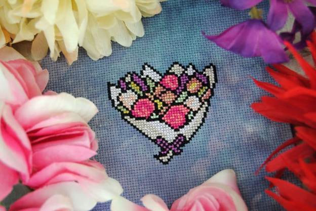
The bouquet itself turned out cute enough, its a free pattern if you’d like to stitch it. Though feel free to substitute in any colors you have on hand — maybe your own least used colors?
Sirithre_Bouquet_PatternDownload
Or, if you prefer a more pattern keeper friendly version:
Sirithre_Bouquet_Pattern_PKFriendlyDownload
I’ll keep tracking my colors and maybe eventually do this challenge again after a few years. Obviously it won’t be ‘colors I’ve never used’ then, just those least used.
In the meantime, I’ll definitely be on the lookout for a good place to finally use 524. Hopefully it won’t have to wait another 10 years!


